Pages

Showing posts with label Green. Show all posts

Wednesday, March 21, 2012

Revlon Jaded

Picked this up a while ago when it was on clearance at Target. I love these mint green/blue type of colors. I just really like how they look when I look down at my hands (moreso than looking at them in photos). I think they help my hands look tan :)


Jaded1

Jaded2

Jaded3

Jaded4

Jaded5


3 coats Revlon Jaded
1 coat Poshe

This is exactly what I picture for Essie Mint Candy Apple, but MCA isn't this color (it's far more blue). Jaded is somewhere between a light mint and light sea foam green creme. Definitely more green than MCA. Ironically, the application was extremely similar to MCA... not really a good thing =/

Working with this polish is extremely similar to how I have to work with Essie cremes. Not the first coat necessarily, but the way the polish started reacting. First coat started uneven and patchy which made me nervous. Second coat was that uncomfortable "do I do another coat and risk it looks too puffy and thick" or "do I leave it at two coats when it's a little patchy". I went with three. The polish didn't seem to like the third coat, it kinda dragged. A top coat did help to even it out to give it a smooth finish, but it's still kinda bumpy. When I look down at my nails, you can't really tell at all, though. How to solve this problem? I have found is to let the polish rest in between nails. I have to use this "technique" a LOT with Essie polishes. Be prepared that applying this polish is not going to be a quick process. Do a nail in as few strokes as possible, then let the brush rest in the polish. You can't quickly go from nail to nail. You may be able to get away with that for the first coat, but after that you really need to let the brush sit. I think had I been more patient, it would have had looked a little nicer.

Sunday, October 23, 2011

Gorgeous Orly Enchanted Forest

Welcome To My 100th Post!!
Was gonna do something special for it, but couldn't think of something. Lol, so bad I know. But instead...
Continuing on with my Once Upon A Time polishes, here is Enchanted Forest. One of my FAVORITE greens, creme or otherwise. It's just beautiful. Have a look...


Orly Enchanted Forest

Orly Enchanted Forest

Orly Enchanted Forest

Orly Enchanted Forest


Direct Sunlight

Orly Enchanted Forest

Orly Enchanted Forest

Orly Enchanted Forest


2 coats Orly Enchanted Forest
1 coat Poshe

The color of this green is beautiful. It's an obvious blue-based dark green creme, which I think is a nice change from yellow-based greens (which I love too!). I've seen some photos that make this polish look yellow-based. No idea how that was managed, but let me assure you it is definitely blue. In some lights, it almost looks like a deep green teal. Those "some lights" is the lighting as I sit in front of my computer typing this. Anyway, I think the name Enchanted Forest fits it perfectly. I imagined Orly choosing the name Enchanted Forest for an unknown color, and this is what they came up with.

The formula was lovely. Not as thick as some of Orly's newer cremes, but beautifully and easily opaque in 2 thin coats. First coat seemed a little uneven, but it was perfectly evened out with the second coat.

Saturday, July 23, 2011

Green Fauxnad

This is actually a mani from a week ago, but the photos hadn't come out that great so I wasn't going to post it. Then I realized it's been 5 days since my last post, and I'm working today and tomorrow and possibly Monday, so that means more days without posts (because I can't wear polish to work). So I figured I'd throw this together before going to work today.

Over the time I hadn't post, I did keep polish on my nails... obviously!! Haha. But I wore my blue holo leopard mani for a good few days. 1. Because I liked it and 2. Because I never had time to change it. Then Thursday I quickly threw on OPI Stranger Tides because I wanted something more demure. I went out with a friend that day and she looks at my nails and goes "your nails are so boring today!!". It was hysterical because I had no idea she actually paid attention to my nails!! Haha.


4 coats OPI Gargantuan Green Grape
Bundle Monster plate BM-208 with Orly Enchanted Forest

The stamping looks so off in these photos, but I SWEAR it looked great in real life!! Anyway, I'm loving these new Bundle Monster plates!! Highly recommended!!

Wednesday, July 13, 2011

Love/Hate Relationship with Gargantuan Green Grape

I stared at my Helmer for a good 20 minutes today trying to decide what to wear. I even went through my spreadsheet and tried to pick an untried. Everything I wanted to wear was either blue, pink, or glittery. I've been wearing SO many different blues and pinks lately, and I'm avoiding glitter due to numerous (4) silk wraps because removal would be awful. And I flat out refuse to wear any dark/vampy colors during the summertime. I also wanted to use my new BM plates with whatever color I chose.

And finally I chose OPI Gargantuan Green Grape, which I haven't worn in a LONG time. You'll read why after the photos.

**These first photos in the sunlight are more accurate color-wise**

OPI Gargantuan Green Grape Swatch

OPI Gargantuan Green Grape Swatch

OPI Gargantuan Green Grape Swatch

OPI Gargantuan Green Grape Swatch

OPI Gargantuan Green Grape Swatch

OPI Gargantuan Green Grape Swatch

OPI Gargantuan Green Grape Swatch

OPI Gargantuan Green Grape Swatch

OPI Gargantuan Green Grape Swatch

4 (Yes, FOUR) coats Gargantuan Green Grape
1 coat Poshe

GGG is a delicious bright, pastel springy green. It does NOT look like snot on your nails like it could have potential to. I have not found another green like this despite my numerous searches. It's very unique and just so lovely.

The problem is a HUGE downfall. Aside from my disdain for the ProWide brush, this formula is crap. You have to be prepared to baby this polish. It is thin and streaky, requires a delicate touch, and you cannot use too many strokes or it will give you cuticle drag like whoa. Even after 4 coats, it coulda used another because there are some bare spots, but they're not too noticeable.
I don't understand why OPI would put out such a terribly quality polish. Maybe because they know it's a gorgeous, unique color and if they changed the formula, it'd change the color.

It's unfortunate because this would be such a staple polish for me if it weren't for the formula.

Thursday, July 7, 2011

A Bad Brush Killed Gray's Anatomy

I actually Konaded on my most recent mani, but I did it at night and never took photos. I have this bad habit of not top coating my Konads, and I went to the beach the next day. I think that explains why I have no photos of it. Lol.

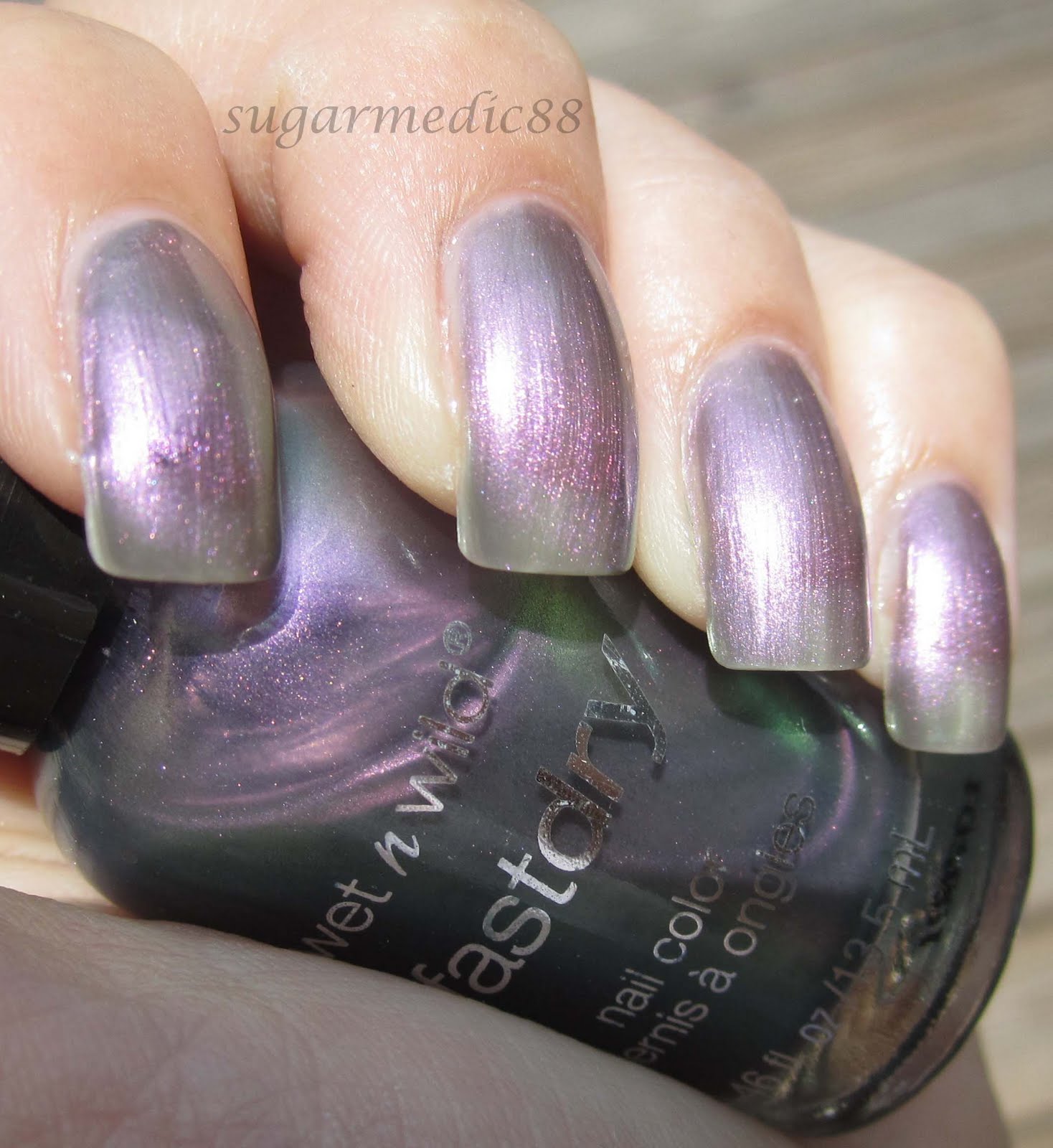
Anyway, I had no idea what I wanted to do to my nails today. I knew I didn't want to wear a creme, which kinda sucked because I actually have a bunch of untried cremes that I've been dying to wear. Then I saw Wet 'n Wild Gray's Anatomy, which is apparently an alternative (but not total dupe) for OPI Not Like The Movies. I do not own NLTM, so I apologize for not being able to offer a comparison, but here and here are blogs with a comparison if you're curious.


Direct Sunlight


3 (thicker) coats Gray's Anatomy
1 coat Poshe

Now, I love duochromes. They're the cloudy day holo IMO. By far one of my favorite finishes. Sally Hansen Golden Cinnabar is one of my favs. This... not even close.

This is a silvery, purple-grey-green duochrome that has visible purple shimmer when in the sunlight. I think this color should have been released in the fall, not spring.

The forumla was WAY too thin. The photos are 3 thick coats, and there is still VNL (visible nail line). I just could not deal with doing another coat. The VNL isn't terribly noticeable in real life, and the duochrome does a pretty good job at camoflauging it. But in the sunlight, it is VERY noticeable, as is the sheerness of this polish.
The worst part was the brush. I do not have any other WnW Fast Dry polishes to compare to this one, but it made application a bigger pain. It flares at the end, is too round, the bristles are too thick so it left very obvious brush strokes, and the bristles are uneven. No thank you. Honestly, if the brush were better, I would have tolerated doing 6 coats if this polish needed it because it really is pretty and I love duochromes. I don't mind doing a ton of coats for a sheer polish, but not with this brush:


It doesn't look THAT bad, but oh it was.

Luckily I work tomorrow, so this mani only has about 9 hours left before it comes off. Which is also why I'm not bothering to redo this or to just do a different mani all together.

Tuesday, July 5, 2011

Forever 21 Mint Green

MY BLOG!!!!!! I've missed you!! I know I only posted 3 days ago, but those nails were actually from almost a week ago. I have had an INSANE week with no time to sit down and do anything. I didn't even get to do Fourth of July nails :( That really sucks because I had SO many ideas and I was SO excited for them, but I worked the first through the third and can't wear polish to work. So that was out. And I was trying to hurry up to get to the beach with some friends on the 4th. I tried using these nail polish strips from Nailene, but they were SO horrible I gave up after 3 nails. I'll make a post about those soon, hopefully.

Anyway, I was at Forever 21 recently with my sister, and I picked up 3 polishes. Can I please say again how much I LOVE Forever 21 polishes (they're actually called Love & Beauty)?? Huge selection of colors and finishes and great quality. Best thing? They cost $2.80. Worst thing? They have the most stupid and frustrating names. Online the names look better, but when you're in the store, the names are just dumb. I picked up "Mint", "Lime", and "Taupe". The most frustrating thing is there are different polishes with the same names.

Anyway, today I'm wearing Mint.

DISCLAIMER
These photos make my cuticles look disgustingly dry. That's NOT my cuticles. This is the result of a brand new bottle of Poshe that was so not-viscous it leaked all over my cuticles and dried so it makes my cuticles look all nasty. Please compare to my previous post to prove my cuticles aren't actually gross.

Forever 21 Love & Beauty Mint Swatch

Forever 21 Love & Beauty Mint Swatch

Forever 21 Love & Beauty Mint Swatch

2 coats Mint
1 coat Poshe

I got a defective brush with this one :( This is the only bad brush I've gotten from Love & Beauty. I have 7 others were perfect brushes. I'm going to say this is my own fault for not checking. The 2 others I bought that day have perfect brushes. I even opened this polish to check consistency. I wanted to make sure it looked like it was going to be opaque. But I paid no attention to the brush. It actually wasn't THAT bad, but the spread of the brush was uneven, and the bristles just weren't dense and even. The result of this was I had to be more meticulous around my cuticle. Other than that, it was okay.

The color is lovely. It's a very light, blue based mint green. It's very fresh looking and will make your hands look SUPER tan.

The formula was fine, but the wonky brush made it a little difficult. It was opaque with 2 coats, not too thick or too thin, just a great creme. As a result of the brush, I had quite a few bubbles that I noticed with my macro photos. Not noticeable in real life. But I do remember seeing bubbles when I painted, and I know it's because of the weird bristles and spacing of the brush.

Thursday, June 23, 2011

Summery, Sparkly Finger Paints

My Finger Paints collection isn't particularly huge because whenever I try them, I tend to be disappointed by their formula. That, and their colors don't tend to stand out to me. I own some pretty old ones, but prior to this one, the last FP I bought was Chrysanthe-Mum's The Word... which was horrendous.

So anyway, I had a coupon for a free Finger Paints if I renewed my Sally's card this month. Ironically, I had been at the casino recently checking out some Butter London's and I kept staring at Henley Regatta. I came super close to buying it, but figured I'd wait. I had been looking into Butter London for a while, but if I'm spending $14 for polish, it has to be super awesome and not dupe-able. Lucky I didn't purchase it, because I then came across this post from The Poslishaholic that compares Henley Regatta to Finger Paints All You Need Is Color. Not exact dupes, but close enough for me!! So I picked this up 2 days ago when I renewed my card.

I had been trying to think of a base to use because the thought of glitter removal 9 times out of 10 (ok, more like 99 times out of 100) deters me from even bothering. I figured a base would help with the removal, and I wouldn't have to use like 3 layers to get the glitter opaque. This was actually the reason for me choosing my mani yesterday.

So here's what it looks like today.


Close-Up


2 coats Orly Bailamos
1 coat Poshe
1 coat All You Need Is Color
1 coat Poshe
*See the bottom of this post if you're wondering why you're not seeing my pinkie in my left hand photos.

This polish is packed full of blue and green glitter in a thick, clear jelly base, and the base is a good thing because it allows the glitter to be packed together instead of sparse. Judging by some swatches I did on a nail wheel, it looks like without a base coat, you'd need 3 coats of AYNIC for it to be opaque on the nail. I'm pretty happy with using Bailamos as a base because it color matches super well and even though you may see it peeking through in my photos, you'd have to stare very closely at my nails to see those gaps in real life.

I elected to do just 2 accents nails on each hand more so for removal purposes. Even with the foil/felt method, I'm still dreading it. 4 nails seems much easier than 10 9. Stupid pinkie... still wrapped in a Band-Aid because I have no idea what to do about it still. Maybe I'll silk wrap it Sunday.

Wednesday, June 22, 2011

Bad Day for Orly Bailamos

Lately I've been painting my nails at night for the next day. I never have problems with sheet marks or anything like that, and it leaves me time in the morning to get ready doing other things besides my nails. So last night I decided I was going to wear Orly Bailamos. This is one of my favorite Orly polishes!! It was in their summer Viva! collection. My sister chose this for me for my birthday last year, and I actually ended up getting a back up bottle when a girlfriend of mine who works at CVS saw it on clearance there for like 99 cents.

As I said, I did my nails last night. Well today is ucky and grey and is supposedly going to rain in the afternoon and evening. This meant AWFUL lighting for photos of this polish I'm so disappointed. This could be solved if I had a light box, but as of now, I'm not interested in making one. But the photos aren't THAT bad, their just not as bright as they could be and aren't showing the full potential of the polish. The benefit of them, however, is you can see a very realistic version of this polish, instead of it being in the most ideal setting on a gorgeous summer day.

Orly Bailamos Swatch

Orly Bailamos Swatch

Orly Bailamos Swatch

Orly Bailamos Swatch

2 coats Bailamos
1 coat Poshe

The color is amazing. Gorgeous, summery, ocean-y, just amazing. It is incredibly dimensional with a duochrome feel, but it's definitely not a duochrome. I've seen most photos that show the aqua/turquoise in the polish, but mine are really showcasing the teal and cerulean side. In some indoor lighting, I've noticed it even looks arguably green-ish. It has a cohesive shimmer that blends well with the base colors, and I think it's the shimmer that gives this polish so many interpretations. Think deep Caribbean ocean.

Great formula, opaque in 2 coats, no streaking. A very happy medium between thin and thick. I find Orly's cremes to be on the thicker side, but this is thinner than that. A huge reason why I love Orly.

I have plans for this polish tomorrow. Not much, but I can definitely build onto it for a couple of days. Unfortunately, I only have 2 days with this polish (due to work), and it looks like rain both days. I'm so irritated with the weather here. Because of these random 1 or 2 nice days, then straight back to cloudy, rainy, chilly, it just still hasn't felt like summer :(

Monday, June 20, 2011

How To: Funky, Fun Fauxnad French

Ok, I don't really wanna call this a French, because IMO, it's not. But I really liked the alliteration I had going for the title. It sounded more fun than "Funky Fun Fauxnad Tips" which is what I really wanted to call it.

I texted a pic of this to several of my friends, and two of them came back describing this mani in these words:

"They look like go go nails!" and another friend said I should do nails for weddings, and I said something along the lines of who the heck would want these nails for their wedding and she said "U could do all gypsy weddings!!!!!!!!"

I knew I wanted to do something with my Tree Hugger mani, but I wasn't sure what. It's like the perfect base color for something really awesome. Dotting, striping, Konading, decaling, 3D art-ing, SOMETHING!! I needed to do something to it. I almost went with dotting, but I couldn't quite pinpoint what I wanted to do. Then I had an idea for a BM plate, but wasn't sure if that's really what I wanted. So I asked my boyfriend what he thought, and he chose the BM design. This is the final result...


What You'll Need:
♥ A bright, fun polish as a base (I used 2 coats China Glaze Tree Hugger)
♥ Your favorite fast dry top coat (I used Poshe)
♥ A white polish for the base for the fauxnad (I used Sally Hansen Xtreme Wear White On)
♥ A black polish for the fauxnad stamping (I used Sinful Black on Black)
♥ Bundle Monster plate BM21
♥ Stamper and Scraper
♥ Tape

How To Do It:
1. Started with my base of Tree Hugger. You can use whatever color you'd like.


2. Tape off a diagonal section leaving the tip of the nail exposed. Make sure the tape isn't raised in little areas at the line you'll be painting on.
*A tip from Chloe's Nails that I highly suggest is stick the tape to your hand first to get rid of some of the super stickiness. That way it won't peel up your base.


3. Paint over the exposed tip with White On. I used just one coat if you were curious.


4. Remove the tape slowly and while the polish is still wet! You don't have to paint and rip the tape off immediately, just don't let the white dry or you risk pulling up the white. Top with 1 coat Poshe and wait until dry.


5. Re-tape the same way you did when you applied the white. It doesn't have to be PERFECTLY exact, but get as close as you can.


6. Use this design from Bundle Monster plate BM21 and paint with Black on Black.


7. Pick it up on the stamper.
*I know it missed a small portion, but this does not matter. It's not going to affect the way it stamps.


8. Stamp into the white HORIZONTALLY, the way I showed the stamper above. Don't stamp vertically like you would if you were doing it over the entire nail. You need more width than length, so it makes more sense to do it this way.


* You can see that the part that didn't pick up on the stamper doesn't even come near the white. It's all the way on the bottom right part of the tape.

9. Remove the tape and voila! Top with another coat of Poshe.