Pages

Monday, August 8, 2011

China Glaze Peachy Keen

I bought this polish a WHILE ago and had used it in nail designs and water marbling, but I hadn't worn it on its own yet. I was looking for something different than what I usually wear color-wise. And once we hit fall, I probably won't touch this color again until spring next year. So better late than never!!

China Glaze Peachy Keen Swatch

China Glaze Peachy Keen Swatch

China Glaze Peachy Keen Swatch

China Glaze Peachy Keen Swatch

2 coats Peachy Keen
1 coat Poshe

Peachy Keen is a difficult color to describe for me. It is a dark peach that leans orange rather than pink. But only VERY slightly. And it doesn't have a yellow undertone at all. It dries quite different from the bottle. A GOOD few shades darker and less orange/more pink than the bottle. I kinda wish it kept the aesthetic from the color in the bottle instead. They really are like two completely different colors to me. I really wish the color overall was lighter. Which is why I'm dying to get Illamasqua Purity. From comp photos I've seen, it seems exactly like what I'm looking for!!

The formula was interesting. It's a very predictable creme formula, which is just neutral, not necessarily a good or bad thing. It was uneven, but not streaky. Luckily, my top coat evened everything out. I had some cuticle drag on my middle finger, but I think that's just because I was way too overzealous with with my application on that nail, and I forced it to happen. I was going to do a third coat to try to see if it would even everything before the top coat, but I was afraid the color would be even darker, and I didn't want that, so I stopped at 2.

This is the peach color that I'm looking for:


Does anyone have any recommendations for this color!?

If you're curious, it's a screenshot from the CPR video on supersexyCPR.com. And now to step on my soapbox... If you haven't taken a CPR course, you totally should!! And even if you have no intentions of doing so, at least check out this YouTube video about Hands-Only CPR. You do not need to be trained to perform CPR, and you don't even need to put your mouth anywhere near theirs. All you need to do is compressions!!

Thursday, August 4, 2011

OPI Rumple's Wiggin'

I've wanted this polish for-gosh-darn-ever!! From the second I saw it. It's nothing that special, I just wanted it. The last Ulta Rewards I was able to get a polish, and I debated between Rumple's Wiggin' and What's With The Cattitude? Obviously, I went with WWTC. But my boyfriend got me RW for my birthday this year, and I've FINALLY decided to wear it!!

OPI Rumple's Wiggin' Swatch

OPI Rumple's Wiggin' Swatch

OPI Rumple's Wiggin' Swatch

2 coats OPI Rumple's Wiggin
1 coat Poshe

This is a lavender that has some blue undertones. I don't know that it is one of those "bright" pastels, but it's right on that line. I wish I had this in the spring. This late into summer isn't the best time to wear this polish, but whatev!!

The formula was similar to most OPI's. Thinner, opaque in 2-3 coats. Not bad at all! The only thing is this polish REALLY brings out any imperfection on my nails. The ridge down my ring finger is super noticeable, and my silk wraps aren't as hidden as they are with other polishes. I don't know if it's because it's a creme. I don't think so because I've had that pinkie silk wrapped for 2 months (it was a VERY bad break), and this is the most noticeable I've seen it despite wearing lots of cremes.

Wednesday, August 3, 2011

Peacock with Orly

I love the combo of Orly Royal Navy and Orly Bailamos. The two colors are SO complimentary to each other. When I see them, I tend to think ocean, but as I was flipping through my new Bundle Monster plates, I saw some peacock looking designs and realized it would look gorgeous with these two colors!! But then when I tried to stamp Bailamos over Royal Navy, it just wasn't happening. It wasn't opaque enough. So sticking with the Orly theme, this is what I went with:

Direct Sunlight
Blue Bundle Monster Peacock Nails

Blue Bundle Monster Peacock Nails

Shade
Blue Bundle Monster Peacock Nails

Blue Bundle Monster Peacock Nails

2 coats Orly Royal Navy
1 coat Poshe
Bundle Monster plate BM-212
Stamping with Orly Frisky
1 coat Poshe

I'm definitely bummed that Bailamos wasn't working well. I feel like the creme finish of Frisky isn't as interesting, but I still think it's gorgeous. I decided to stamp with a gap at the tip just because I thought it looked WAY better than going all the way to the end. It also lets more of Royal Navy show through. I wish I had a topcoat like Pure Ice Heartbreaker because I think it really would've tied everything in together. I've been meaning to buy it, so maybe I'll run to Walmart and pick it up!! Haha.

On the third photo, you can see the polish doing something strange on my ring finger. That was because I stamped that nail with the design going all the way to the tip and because I hated it, I went over it with another coat of Royal Navy then added Poshe. The Poshe caused some shrinkage that I tried to fix, but it didn't work. Eh, oh well! Lol

Monday, August 1, 2011

Orly Royal Navy

I've been working marathon weekends the past two weekends, which severely limits my capability to post. Because I can't wear nail polish to work, my nails stay naked for the weekend. So no posts.

As I was driving around with my partner at work yesterday, I saw a royal blue van that made me completely decide I'd wear Orly Royal Navy today. As we approached it (we were on the highway), I thought maybe I'd avoid blue because I wear it SO much. As we passed the van, he had a US Navy bumper sticker. That had me sold! Royal Navy it is.

Shade
Orly Royal Navy Swatch

Orly Royal Navy Swatch

Orly Royal Navy Swatch

Closeup in Shade
Orly Royal Navy Swatch

Direct Sunlight
Orly Royal Navy Swatch

Orly Royal Navy Swatch

Closeup in Sunlight
Orly Royal Navy Swatch

2 coats Royal Navy
1 coat Poshe

This polish is wicked gorgeous, very, very unique. It's a royal blue jelly packed with a green based turquoise shimmer/microglitter. I hate wearing darker colors in the summer, and not that this is NOT a summer color, but you can see how pale it makes my hands look especially in the not direct sunlight photos. If you compare it to my last post, you can see the HUGE difference. But it's still so pretty. I have a warm/neutral skintone, but I have olive/yellow undertones. This polish brings out some random pink-ness in my skintone, so I have no idea how those with a cool skintone/pink undertones would fair with this polish.

The formula is interesting is a good way. Because it's a jelly, it's a thin, almost watery consistency, however it is very pigmented. It goes on even, and if you don't mind VNL, you could probably get away with 1 generous coat. I went with 2 because I didn't want the color to be too rich, and even though you can see VNL in the photos, it's not nearly that noticeable in real life. But it's so easy to work with it's amazing. Reminds me of the old, non-B3F polishes.
My biggest annoyance with this polish is the microglitter settles at the bottom of the bottle and you haveta shake the crap out of it to get the particles to suspend in the polish. I'm assuming this is due to the jelly, thin consistency. But because it's a jelly, you can shake it for 10 minutes and put it on immediately, and you won't have any problems with bubbles.

Wednesday, July 27, 2011

Forever 21 Love & Beauty Pink

L&B has the most obnoxious names for their polishes. Their names are literally the color of the polish. This one is called "Pink". More specifically, it's MA120 Pink, just in case you were curious.

I have been dying to wear this because it's so similar to a peachy color I've been wanting. However, this one is just a little too pink, so I think I have to take a trip to NYC and pick up Illamasqua Purity. Anyway, here's "Pink".

**This polish was EXTREMELY difficult to photograph accurately. This first photo is as close as I could get to the actual color**


Sunlight


Shade


2 coats Pink
1 coat Poshe

This polish is one of those neon (bright) pastels. Definitely not a true neon, though it photographs almost as difficult as a neon, which is a HUGE pain. It's a bright creme salmon that goes on several shades darker than the bottle. It has more of a peachy hue than the photos show, it has almost a coral kinda feel. It is also brighter in real life. From photos I've seen, it looks VERY comparable to Orly Cotton Candy, however I do not own Cotton Candy to compare directly.

The formula was totally fine. Opaque and streak-free in 2 coats. First coat seemed a little uneven, but that was totally fixed with the second coat. No cuticle drag, either. The brush is pretty average, and that's actually not a bad thing!!

Monday, July 25, 2011

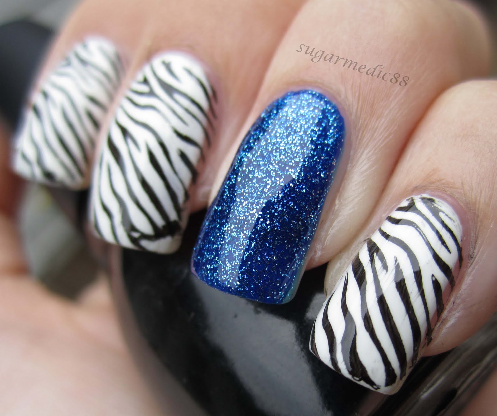
Zebra With Some Accents

Another day of no idea what to do. I texted my friend this morning whining about how I had NO idea what to do with my nails today. She suggested houndstooth, so I had a go with my old BM plates, which are typically fine in width... however my nails are far too long to do that right now. I needed to try something else. I already had my nails painted white, so this is what I came up with...


Started with:
2 coats Sally Hansen Xtreme Wear in White On
1 coat Poshe

Pinkie, Middle, Index:
Bundle Monster plate BM-223 (zebra) stamped with Sinful Black on Black
1 coat Poshe

Thumb:
Bundle Monster plate BM-223 (zebra) stamped with Orly Royal Navy
Bundle Monster plate BM15 (feather) stamped with Sinful Black on Black
1 coat Poshe

Ring:
1 coat Orly Royal Navy
3 coats China Glaze Dorothy Who?
1 coat Poshe

Oh yeah. How amazingly tacky is this?? I'm all about it, obviously. I messed around with so many different ways of doing this because I had only an iffy vision of what I wanted. Plain zebra stripes was not an option. I debated about doing something red over the zebra (maybe a red rose or something like that), but then I saw Dorothy Who? and decided I had to go with blue. I chose Royal Navy as the zebra on my thumb simply because the feather didn't work over black, even when stamped with a dark, opaque blue (not Royal Navy). The feather, by the way, has zero significance. I just wanted something that wasn't too complicated, and was dense enough to go over the zebra stripes so you would still be able to figure out what it was.

Speaking of the friend I was texting, she doesn't get to see it until tomorrow. Unless she can find my blog. I think only one of my friends has seen my blog. And in case he comes across it again...
HI JIM!!!!!!!!!

Saturday, July 23, 2011

Green Fauxnad

This is actually a mani from a week ago, but the photos hadn't come out that great so I wasn't going to post it. Then I realized it's been 5 days since my last post, and I'm working today and tomorrow and possibly Monday, so that means more days without posts (because I can't wear polish to work). So I figured I'd throw this together before going to work today.

Over the time I hadn't post, I did keep polish on my nails... obviously!! Haha. But I wore my blue holo leopard mani for a good few days. 1. Because I liked it and 2. Because I never had time to change it. Then Thursday I quickly threw on OPI Stranger Tides because I wanted something more demure. I went out with a friend that day and she looks at my nails and goes "your nails are so boring today!!". It was hysterical because I had no idea she actually paid attention to my nails!! Haha.


4 coats OPI Gargantuan Green Grape
Bundle Monster plate BM-208 with Orly Enchanted Forest

The stamping looks so off in these photos, but I SWEAR it looked great in real life!! Anyway, I'm loving these new Bundle Monster plates!! Highly recommended!!