Pages

Showing posts with label Orange. Show all posts

Friday, December 2, 2011

MAC Bad Fairy

Remember when people were ALL OVER this polish? It came out fall of last year when the duochrome foils were HUGE. Bad Fairy was the only one of the MAC Venomous Villains polishes that wasn't a dupe for an Orly Cosmic FX polish. It was its own polish.


BadFairy1

BadFairy2

BadFairy3

BadFairy4

BadFairy5

BadFairy6

BadFairy7

BadFairy8


2 coats MAC Bad Fairy
1 coat Poshe

I snatched 2 of these suckers up when I caught it just right online when they were back in stock at Nordstrom. I'm so glad I did! Not only is this one of my fav polishes, but its one of my sisters as well! I'm about 1/3 of the way through the bottle so I'm glad I have a backup!

This is a gorgeous dark pink/warm orange duochrome. At first glance it seems like a simple foil polish, but as soon as you move the duochrome is very prominent. I love duochromes because they're like an "indoor holo" to me. You know how you need good light for a holo to really look amazing? Duochromes look special and awesome in any light.

The formula was ok, but the brush was freakin' horrendous. The polish is kinda streaky, but these types of polishes can be finicky anyway. Definitely tolerable and not frustrating. You just can't do a ton of strokes of you get bald spots. So long as you use a light touch and don't go over it a ton of times you'll be fine. But the brush was just bad. I had to trim it because there were bristles going whichever direction they felt like, and it's not a very dense brush it it flares at the tip. Not in a good way. Again it's tolerable, but for $13 I expect WAY more higher quality packaging. I have 99 cent polishes with AMAZING brushes that make MACs look like a brush from a pack of 10 watercolor brushes from the dollar store complete with 10 bristles per brush. Point being, I really expected a better brush for $13.

Wednesday, September 7, 2011

Sunburst After A Hurricane

Found this at Ocean State Job Lot the other day. It's from the Bloom Collection that came out in Spring of this year. OSJL also had Collecting Pollen and Cherry Blossom, but I passed on those two. Def woulda bought Garden Hose and Bird Bath if they had 'em. Anyway, in an attempt to find the perfect peach color, I grabbed this with the intention of trying to franken it (which I’ve never attempted) to be that color. In the meantime, I might as well give it a try on its own.

Wet n Wild Sunburst

Wet n Wild Sunburst

Wet n Wild Sunburst

Wet n Wild Sunburst


Direct Sunlight
Wet n Wild Sunburst

Wet n Wild Sunburst


3 coats Wet n Wild Sunburst
1 coat Poshe

I might think this color is ugly? Myabe not ugly, but I don't know how I feel about it. It’s a yellow-toned light orange crème. Wet n Wild called it pastel. I'd say it's definitely not pastel. Light, yes. Pastel, no. It starts to remind me of the orange powdered cheese that comes with Kraft Mac and Cheese, but ultimately, I don't think it does. It definitely looks more attractive in different lighting, though. By the end of the day I started liking it more.

The application was… confusing? Gosh this polish is ridiculous. From the bizarre color to the strange formula. Anyway, it seems to be decently pigmented, the consistency doesn’t seem thin and it‘s definitely not thick… but it’s SO uneven. You can kinda tell in photos. I’m surprised the macro didn’t accentuate it! But you can definitely notice the cuticle drag on my pinkie.
Its like my base coat straight up repelled this polish and I have no idea why. I have NEVER had this problem. I have two bases I use. Nail Tek Intensive Therapy II on my non-silk wrapped nails and then Sally Hansen Double Duty on my silk wrapped nails (only 2 are silk wrapped right now). The ones with the Nail Tek REALLY hated this polish. It acted similarly to a Tronica polish. It had the drag up that holos get, but not sticky like a linear holo. I’m truly dumbfounded, but I will say use a sticky base coat if you’re applying this polish.

BONUS!!

Paisley

And I had to throw in this photo of Paisley squinting up at me in the bright sunshine! Haha! So cute.

Monday, August 8, 2011

China Glaze Peachy Keen

I bought this polish a WHILE ago and had used it in nail designs and water marbling, but I hadn't worn it on its own yet. I was looking for something different than what I usually wear color-wise. And once we hit fall, I probably won't touch this color again until spring next year. So better late than never!!

China Glaze Peachy Keen Swatch

China Glaze Peachy Keen Swatch

China Glaze Peachy Keen Swatch

China Glaze Peachy Keen Swatch

2 coats Peachy Keen
1 coat Poshe

Peachy Keen is a difficult color to describe for me. It is a dark peach that leans orange rather than pink. But only VERY slightly. And it doesn't have a yellow undertone at all. It dries quite different from the bottle. A GOOD few shades darker and less orange/more pink than the bottle. I kinda wish it kept the aesthetic from the color in the bottle instead. They really are like two completely different colors to me. I really wish the color overall was lighter. Which is why I'm dying to get Illamasqua Purity. From comp photos I've seen, it seems exactly like what I'm looking for!!

The formula was interesting. It's a very predictable creme formula, which is just neutral, not necessarily a good or bad thing. It was uneven, but not streaky. Luckily, my top coat evened everything out. I had some cuticle drag on my middle finger, but I think that's just because I was way too overzealous with with my application on that nail, and I forced it to happen. I was going to do a third coat to try to see if it would even everything before the top coat, but I was afraid the color would be even darker, and I didn't want that, so I stopped at 2.

This is the peach color that I'm looking for:


Does anyone have any recommendations for this color!?

If you're curious, it's a screenshot from the CPR video on supersexyCPR.com. And now to step on my soapbox... If you haven't taken a CPR course, you totally should!! And even if you have no intentions of doing so, at least check out this YouTube video about Hands-Only CPR. You do not need to be trained to perform CPR, and you don't even need to put your mouth anywhere near theirs. All you need to do is compressions!!

Thursday, June 9, 2011

Love & Beauty Coral

I'm pretty sure I've mentioned this before, but in case I haven't, I LOVE Forever 21 polishes. If you see a color you like, do not hesitate to pick it up. They cost $2.80 and I haven't been disappointed yet! And they have a good range of finishes, not just simple cremes like many stores do. Love & Beauty if the name of their cosmetics line, but I tend to use Forever 21 and Love & Beauty interchangeably when I talk about their polish.

Looking on their website at their polish, it looks like they have interesting names such as "Fun Fuchsia", "Feminine Wiles", "Liquid Silver", and "Clear Skies". However, when I'm in the store, their polishes don't have those names at all. My small collection of Forever 21 polishes consists of names such as "Pink", "Nude", "Taupe", and "Light Green". And that's how I see them labeled in the store. I had also noticed that in the store, there was more than one polish called "Pink" for example, but they were certainly not the same polish. I don't know if the interesting names are just for online purposes and they're the same as the ones in the store or what. Regardless, it's odd. But anyway, here's "Coral".

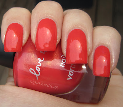
Forever 21 Love & Beauty Coral Swatch

Forever 21 Love & Beauty Coral Swatch

Forever 21 Love & Beauty Coral Swatch

Forever 21 Love & Beauty Coral Swatch

Forever 21 Love & Beauty Coral Swatch

Forever 21 Love & Beauty Coral Swatch

Close Up
Forever 21 Love & Beauty Coral Swatch

2 coats Coral
1 coat Poshe

Not a color I tend to gravitate to generally, but it's really gorgeous. By the name, it obviously suggests that it's coral, but it's definitely a red coral. The other thing that I love is the very fine gold shimmer. It gives the polish a nice dimension that greatly compliments the overall look and adds a warmth to the polish while still maintaining that it's definitely a summer color. It's clearly not just a creme. The shimmer is more noticeable in the bottle, and because of the orange-ness of the color, the polish certainly does not look gold on the nail. It's just beautiful. And I don't tend to wear reds. Granted I wouldn't call this strictly red, but it definitely leans that way. I do love coral, though.

The formula was great. Opaque in 2 coats, not streaky or uneven at all. The polish consistency was on the thin side, but thin like old OPI before the formula change, not thin like watery and unworkable. So this makes for a very easy to work with polish. The brush average size and is rounded and very dense with clear bristles. It could be a little more flat in my opinion, but it doesn't do that stupid flare thing at the tip like some round brushes do. I think it's because the brush is so dense.

Tuesday, May 31, 2011

One More With Revlon Electric - Retro

So far this is the third thing I've done to build upon my intial mani of just simply Revlon Electric. I had added a white floral bundle monster print the next day. Charlotte Sparkle had made a comment that I should've done the orange dots in the flowers (I had left them just white). Well, she was totally right. I should have:


Closeup


2-3 coats Electric
1 coat Poshe
Stamping done with Konad white polish and BM16
Dots with China Glaze Peachy Keen

There is no top coat over the design, and this is my third day with this mani, so there is a little bit of wear. Luckily, it's MUCH less obvious in real life as opposed to the close up photos. Yesterday was the last day I planned to wear this mani, and I didn't add the orange dots until afterwards. Makes me wanna wear it for another full day with the dots... and I actually think I will. I work tomorrow so if I do a new mani today, it'll have to come off by the evening. I might as well just leave this on!!

I'm really disappointed I didn't do this sooner. I'm sorry these Electric posts have been so repeditive, but hey, at least I'm honest!! Haha. And I hope that things like this help you guys who aren't ready to change your polish but are sick of looking at the same solid color. Add something to it and keep mixing it up!! You don't always have to change your polish to make your nails look different :)

I love the retro feel to this nail. Yesterday it looked lovely and vintage, but now I'm calling it awesome and retro. Just from adding simple orange dots!! I did use a dotting tool to add them, but if you don't have a dotting tool, here is a post I did that listed some other options.

And if you're curious, the Bundle Monster plate I was using I purchased from Amazon.

Wednesday, April 27, 2011

Fun, Bright Summer/Spring Water Marble

I have to start by saying this water marble will make your hands look AMAZINGLY tan.

This was the water marble I intended on doing a tutorial with. However, I only got partially done with it using this water marble. I'll have to finish it another time soon. Anyway, this probably wouldn't have been the best because I did this around 1700 in the evening and the lighting wasn't fantastic, and I had initially started outside, but then all of a sudden the wind picked up and I had to move inside. So I took about half of the photos I wanted to take. Even worse, I was dipping my clean up brush into my bottle of remover and it FELL IN. What a gosh darn mess. So I didn't use it after that because the paint on the handle of the brush was smearing all over thanks to the acetone. So be forewarned that my right hand doesn't have as nice of clean up. I'll discuss another issue with the water marble at the end of the post.

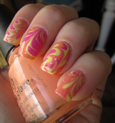
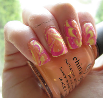
Bright Summer Water Marble

Bright Summer Water Marble

Bright Summer Water Marble

Bright Summer Water Marble

Base:
1 coat Sally Hansen Xtreme Wear in White On
For the water marble:
China Glaze Peachy Keen
China Glaze Lemon Fizz
Orly Basket Case

So here are the two things that I was annoyed at by the end of the water marble.
1. My initial pattern (as seen on my ring finger on my left hand, which are the first photos), ended up altered from the rest. Looking back at photos I took during the process, I realized why I wasn't getting the same pattern on the rest of my nails... because I wasn't doing the initial pattern in the water. Ugh. So I only realized that after I uploaded the photos and my nails were done. Sucks because I REALLY liked how that first nail came out.
2. I had horrible, horrible bubbles with this marble. Because my technique was no different than usual, I can only assume it had something to do with one or more of the polishes I used. If you hadn't noticed, go back and look at the photos and you'll see random little white dots. Those were bubbles that were popped with the top coat was put on. I definitely get bubbles sometimes, but NEVER this bad. I'm kinda confused. But in the future, I think instead of a white base, I might do the lightest color I'll be using in my water marble. Hopefully that will camouflage the bubbles if it happens this badly again.

I might just redo this entire water marble later on. It's more summery anyway, so it'll be perfect in a couple of months.